

Dixon & Townsend
We were contacted by Newark-based Dixon & Townsend, who wanted a new logo for their Mechanical Services company, that was established and well-known in the industry, but relatively unknown outside of that (originally) with no real public facing identity or online presence.
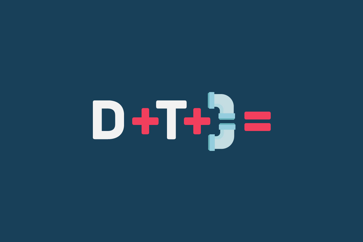
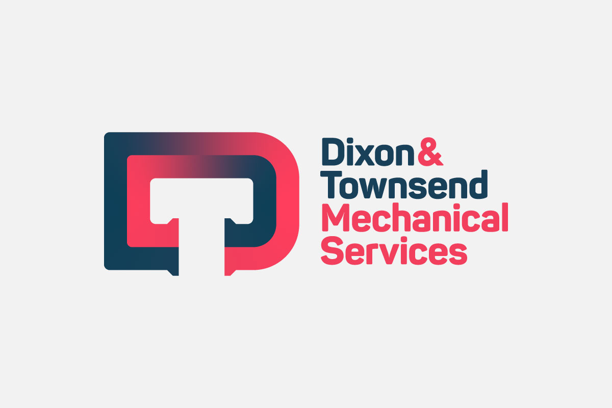
The logo itself is seemingly simple in appearance, yet through the subtle use of negative space it cleverly combines both of the initial letters into one effective monogram. Not only that, the real trick was creating a unique letter form that also resembled pipes, which are they key component for this local business specialising in plumbing and pipework for commercial and industrial projects across the UK.
What do you think?
Like what you see? Could this kind of creative thinking work for you and your business? If you think it might then get in touch. If you don't, call or message us anyway, we'd love to hear your thoughts.
or send a quick message…